您现在的位置是:网站首页> 编程资料编程资料
CSS实现Tab布局的简单实例(必看)CSS Transition通过改变Height实现展开收起元素从QQtabBar看css命名规范BEM的详细介绍css实现两栏布局,左侧固定宽,右侧自适应的多种方法CSS 实现Chrome标签栏的技巧CSS实现两列布局的N种方法CSS实现隐藏搜索框功能(动画正反向序列)CSS3中Animation实现简单的手指点击动画的示例详解CSS中的特指度和层叠问题详解overflow:hidden的作用(溢出隐藏、清除浮动、解决外边距塌陷)关于CSS浮动与取消浮动的问题
 2023-10-21
588人已围观
2023-10-21
588人已围观
简介 下面小编就为大家带来一篇CSS实现Tab布局的简单实例(必看)。小编觉得挺不错的,现在就分享给大家,也给大家做个参考。一起跟随小编过来看看吧
一、布局方式
1、内容与tab分离
ul,li{ margin:0; padding:0; list-style:none; } .container{ width:400px; height:300px; background-color:silver; } .tab-content{ width:100%; height:80%; overflow:hidden; } .tab-content .item{ width:100%; height:100%; } .tab-control{ width:100%; height:20%; } .tab-control ul{ height:100%; } .tab-control li{ width:25%; height:100%; float:left; border:1px solid silver; box-sizing:border-box; background-color:white; cursor: pointer; } .tab-control li:hover{ background-color:#7b7474 } .tab-control a{ display:inline-block; width:100%; height:100%; line-height:100%; text-align:center; text-decoration: none; } .tab-control a::after{ content:""; display:inline-block; height:100%; vertical-align:middle; } .tab-content .item:target{ background:yellow; }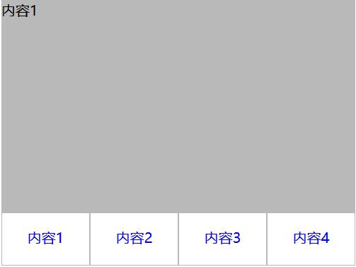
2、内容与tab一体
1
1
2
2
3
3
4
4
ul,li,p{ margin:0; padding:0; list-style:none; } .container{ width:400px; height:300px; background-color:silver; border:1px solid silver; } .container ul{ width:100%; height:100%; overflow:hidden; } .container .item{ float:left; width:25%; height:100%; background-color:white; } .container .item .title{ line-height:40px; border:1px solid silver; box-sizing:border-box; text-align:center; cursor:pointer; } .container .item .content{ width:400%; height:100%; background-color:yellow; } .ml1{ margin-left:-100%; } .ml2{ margin-left:-200%; } .ml3{ margin-left:-300%; } .active{ position:relative; z-index:1 } .container .item:hover{ position:relative; z-index:1 } .container .item:hover .title{ border-bottom:none; background-color:yellow; }
利用负margin,将内容区对齐,然后内容去添加背景色,避免不同tab对应的区域透视重叠。
二、CSS实现交互
1、锚点实现(target)
(1)针对布局一:item从上往下排列,父元素tab-content加上overflow:hidden。利用锚点,点击不同a标签的时候,具有对应ID的item会切换到tab-content的视图中,然后利用hover给tab按钮加上切换样式。
ul,li{ margin:0; padding:0; list-style:none; } .container{ width:400px; height:300px; background-color:silver; } .tab-content{ width:100%; height:80%; overflow:hidden; } .tab-content .item{ width:100%; height:100%; } .tab-control{ width:100%; height:20%; } .tab-control ul{ height:100%; } .tab-control li{ width:25%; height:100%; float:left; border:1px solid silver; box-sizing:border-box; background-color:white; cursor: pointer; } .tab-control li:hover{ background-color:#7b7474 } .tab-control a{ display:inline-block; width:100%; height:100%; line-height:100%; text-align:center; text-decoration: none; } .tab-control a::after{ content:""; display:inline-block; height:100%; vertical-align:middle; }上述方法只是利用了锚点切换,没有使用:target。修改CSS
ul,li{ margin:0; padding:0; list-style:none; } .container{ width:400px; height:300px; background-color:silver; } .tab-content{ position:relative; width:100%; height:80%; overflow:hidden; } .tab-content .item{ position:absolute; left:0; top:0; width:100%; height:100%; } .tab-control{ width:100%; height:20%; } .tab-control ul{ height:100%; } .tab-control li{ width:25%; height:100%; float:left; border:1px solid silver; box-sizing:border-box; background-color:white; cursor: pointer; } .tab-control li:hover{ background-color:#7b7474 } .tab-control a{ display:inline-block; width:100%; height:100%; line-height:100%; text-align:center; text-decoration: none; } .tab-control a::after{ content:""; display:inline-block; height:100%; vertical-align:middle; } .tab-content .item:target{ z-index:1; background-color:yellow; } item使用绝对定位,然后使用:target修改元素z-index达到切换效果(其实也可以通过控制元素的display来达到切换效果)
(2)针对布局二:
ul, li, p { margin: 0; padding: 0; list-style: none; } .container { width: 400px; height: 300px; background-color: silver; border: 1px solid silver; } .container ul { width: 100%; height: 100%; overflow: hidden; } .container .item { float: left; width: 25%; height: 100%; background-color: white; } .container .item .title { line-height: 40px; border: 1px solid silver; box-sizing: border-box; text-align: center; cursor: pointer; } .container .item a { display:inline-block; width:100%; height:100%; text-decoration: none; } .container .item .content { width: 400%; height: 100%; background-color: yellow; } .ml1 { margin-left: -100%; } .ml2 { margin-left: -200%; } .ml3 { margin-left: -300%; } .active { position: relative; z-index: 1 } .container .item:target { position: relative; z-index: 1 } .container .item:target .title { border-bottom: none; background-color: yellow; }
2、hover实现
(1)针对布局一:
无法简单的通过CSS实现
(2)针对布局二:
1
1
2
2
3
3
4
4
ul,li,p{ margin:0; padding:0; list-style:none; } .container{ width:400px; height:300px; background-color:silver; border:1px solid silver; } .container ul{ width:100%; height:100%; overflow:hidden; } .container .item{ float:left; width:25%; height:100%; background-color:white; } .container .item .title{ line-height:40px; border:1px solid silver; box-sizing:border-box; text-align:center; cursor:pointer; } .container .item .content{ width:400%; height:100%; background-color:yellow; } .ml1{ margin-left:-100%; } .ml2{ margin-left:-200%; } .ml3{ margin-left:-300%; } .active{ position:relative; z-index:1 } .container .item:hover{ position:relative; z-index:1 } .container .item:hover .title{ border-bottom:none; background-color:yellow; }3、label与:checked实现
(1)针对布局一:
内容1内容2内容3内容4
ul, li { margin: 0; padding: 0; list-style: none; } .container { width: 400px; height: 300px; background-color: silver; } .tab-content { position: relative; width: 100%; height: 80%; overflow: hidden; } input { margin: 0; width: 0; } .tab-content .item { position: absolute; left: 0; top: 0; width: 100%; height: 100%; } .tab-control { width: 100%; height: 20%; } .tab-control ul { height: 100%; } .tab-control li { width: 25%; height: 100%; float: left; border: 1px solid silver; box-sizing: border-box;
相关内容
- CSS3模拟动画下拉菜单效果纯CSS实现下拉菜单的示例代码CSS导航栏及弹窗示例代码CSS下拉菜单简单制作教程 css制作黑色经典导航下拉菜单你值得拥有的CSS下拉菜单效果基于CSS实现的4级下拉菜单效果代码CSS实现的灰色下拉菜单效果代码纯CSS实现的大型下拉菜单的示例代码
- 避免不必要的浏览器兼容性问题的5个技巧针对IE浏览器的兼容问题小结兼容主流浏览器的CSS透明代码(必看篇)浅谈浏览器的兼容性(必看篇)关于遇到的浏览器兼容问题及应对方法(推荐)浅谈遇到的几个浏览器兼容性问题
- 利用CSS将网站网页变灰色代码示例用css3实现当鼠标移进去时当前亮其他变灰效果css页面变灰度兼容ie、firefox、chrome、opera、safari实现样式网页变灰配合全国哀悼日的css代码 20100421css使图片变灰的实现方法一段css让全站变灰的代码总结
- 中国好学霸 改进了造纸术的东汉室臣 答案是谁_手机游戏_游戏攻略_
- 天天飞车赛车改装技巧_A级赛车开拓者改装教程攻略_手机游戏_游戏攻略_
- 中国好学霸 远嫁匈奴的美女叫什么名字 答案是谁_手机游戏_游戏攻略_
- 中国好学霸 大泽乡起义的领袖人物是谁 图文答案_手机游戏_游戏攻略_
- 中国好学霸 秦始皇的名字是什么 图文答案_手机游戏_游戏攻略_
- 中国好学霸 木工行业的祖师爷是谁 图文答案_手机游戏_游戏攻略_
- 中国好学霸 “讳疾忌医”中这位名医是谁 图文答案_手机游戏_游戏攻略_
点击排行
本栏推荐